By : BRIAN DE SOUZA
MUMBAI :
Logos are an important part of a product’s brand identity, not only do they help a brand stand out from the competition, but also facilitate customer loyalty. Over the last 18 months, the driving forces for change in logo and brand transformation have been the journey towards electrification, as well as the digital age, where a logo not only adorns a car but is used across all communication touchpoints and on social media. For Nissan, the motivation to undertake this brand transformation was to ensure that the company drove into an increasingly connected world even while staying anchored in its heritage and foundational values.
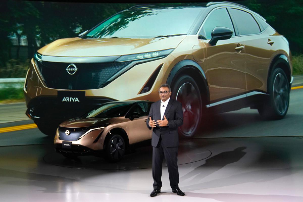
Nissan chose to unveil its new logo, its first such change in 20 years, at the digital launch of its all-new, fully-electric SUV, Ariya.

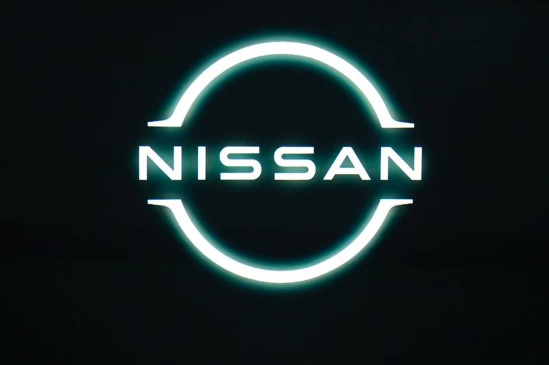
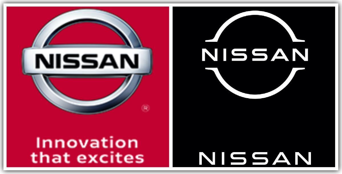
The new flat, two-dimensional logo is minimalist in its essence and replaces the earlier three-dimensional one. While Nissan has kept the name at the logo’s centre, it is no longer raised. It has now been simplified into basic, block lines. The font too has been refined and the lettering is stretched out to create a sense of more in-between space.

In doing so, Nissan joins Volkswagen AG, BMW and MINI which have also gone in for the two-dimensional logo aesthetic. While Mini unveiled its logo avatar at the end of 2018, VW unveiled its logo in September last year and BMW unveiled its new logo early this year.
Nissan kicked of its branding transformation plan in 2017. Senior vice president of global design, Alfonso Albaisa, began to study potential changes to Nissan's logo and brand identity and a design team led by Tsutomu Matsuo, Deputy GM, Advanced Design Department, Nissan, was set up to explore the possibility of a change from a subtle evolution to a complete reinvention. Albaisa offered three keywords to inspire the team to create it: "Thin, Light and Flexible."

After several iterations, Nissan zeroed in on the new logo. Says Matsuo, “The new Nissan logo communicates our guiding message, carried over from past iterations: If you have a strong, determined belief, it can even penetrate the sun.”
The logo in its new avatar will begin appearing this month, both in digital and physical forms. It will appear across mediums from letterheads and dealership signs to social media and digital advertising". Starting with Ariya, Nissan's upcoming electric vehicle offerings will also feature an exclusive illuminated logo lit by 20 LEDs (corresponding to the number of years between the logo redesigns).
According to Nissan, the redesigned logo is a transition from a hard-edged, industrial feel to a refined, familiar and digital-friendly look. It symbolizes the company's dedication to keep innovating for new generations of customers.
Brian De Souza is a Mumbai-based writer.
